container 部分
定义一个 flex 容器:
.container {
  display: flex; /* or inline-flex */
}
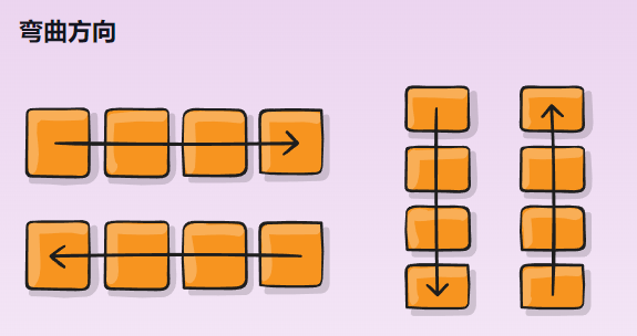
1.flex-direction(主轴排列方向)
建立主轴,从而定义 Flex 项目放置在 Flex 容器中的方向。Flexbox 是单向布局概念。将 flex 项目视为主要布置在水平行或垂直列中。
.container {
  flex-direction: row | row-reverse | column | column-reverse;
}
row(默认):从左到右ltr; 从右到左rtlrow-reverse:从右到左ltr; 从左到右rtlcolumn:同样row但从上到下column-reverse:同样row-reverse但从下到上
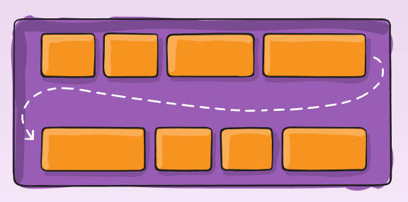
2.flex-wrap(是否换行)
.container{
  flex-wrap: nowrap | wrap | wrap-reverse;
}
nowrap(默认值):所有弹性项目都在一行上wrap:flex 项目将从上到下包裹到多行。wrap-reverse:flex 项目将从下到上包裹多行。
3.flex-flow(flex-direction 和 flex-wrap 的简写)
这是一个简写flex-direction和flex-wrap属性,它们共同定义了 flex 容器的主轴和交叉轴。默认是row nowrap。
flex-flow: <‘flex-direction’> || <‘flex-wrap’>
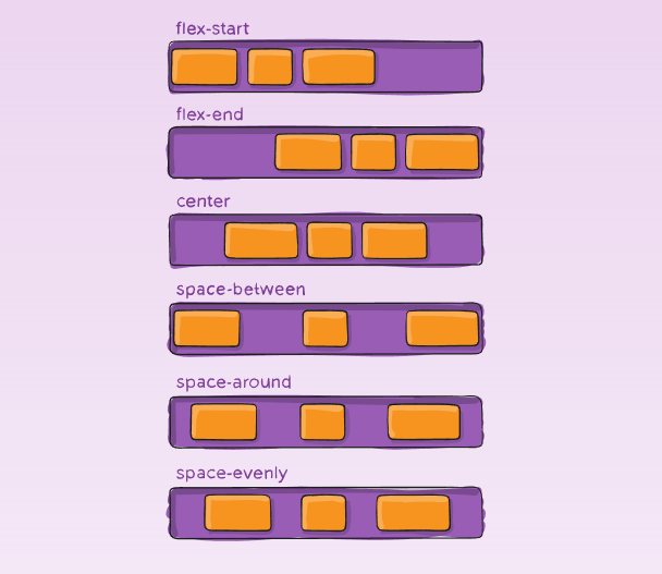
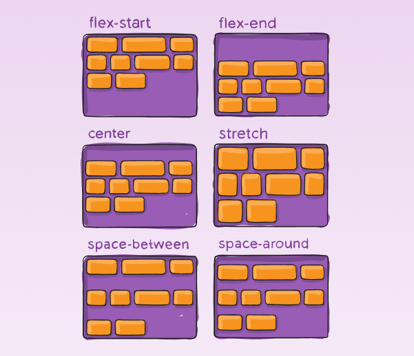
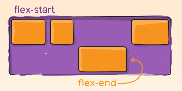
4.justify-content(对齐方式 - 主轴,在父元素设置)
.container {
  justify-content: flex-start | flex-end | center | space-between | space-around | space-evenly;
}
flex-start(默认值):项目位于容器的开头。flex-end:项目位于容器的结尾。center:项目沿着线居中space-between:物品均匀分布在线上; 第一项是在起始行,最后一项是在结束行space-around:项目均匀分布在线条周围,空间相等。请注意,视觉上空间不相等,因为所有项目在两侧都有相等的空间。第一个项目将在容器边缘上有一个空间单位,但在下一个项目之间有两个单位的空间,因为下一个项目有自己适用的间距。space-evenly:项目是分布的,以便任何两个项目之间的间距(和边缘的空间)相等。
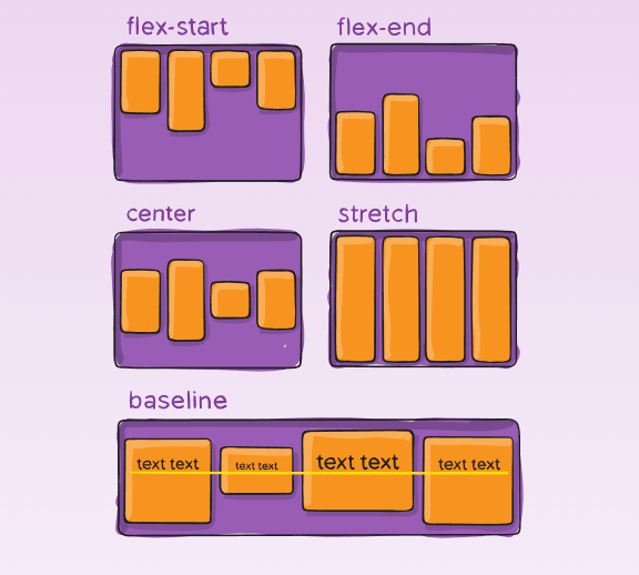
5.align-items(对齐方式 - 纵轴)
这定义了如何沿当前行的横轴布置弹性项目的默认行为。可以将其视为justify-content横轴的版本(垂直于主轴)。
.container {
  align-items: stretch | flex-start | flex-end | center | baseline;
}
stretch(默认):拉伸以填充容器(仍然尊重最小宽度 / 最大宽度)flex-start:项目的交叉开始边距边缘放置在交叉起始线上flex-end:项目的跨端边缘位于交叉线上center:项目以横轴为中心baseline:项目已对齐,例如其基线对齐
6.align-content(对齐弹性盒的元素的各项)
align-content 属性只适用于多行的 flex 容器,并且当侧轴上有多余空间使 flex 容器内的 flex 线对齐。
align-items 和 align-content 有相同的功能,不过不同点是它是用来让每一个单行的容器居中而不是让整个容器居中。
.container {
  align-content: flex-start | flex-end | center | space-between | space-around | stretch;
}
flex-start:元素位于容器的开头flex-end:元素位于容器的末尾center:元素位于容器的中心space-between:线条均匀分布; 第一行是容器的开头,而最后一行是在容器的最后space-around:线条均匀分布,每条线周围的空间相等stretch(默认值):线条拉伸以占用剩余空间
item 部分
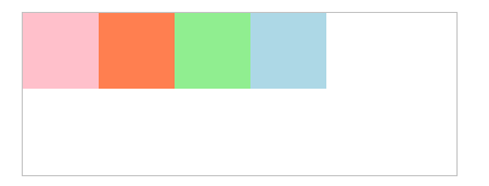
1.order
默认情况下,元素按源顺序排列。但是,该order属性控制它们在 Flex 容器中的显示顺序。
.item {
  order: <integer>; /* default is 0 */
}
#main {
    width: 400px;
    height: 150px;
    border: 1px solid #c3c3c3;
    display: -webkit-flex; /* Safari */
    display: flex;
}
div#myRedDIV   {order: 2;}
div#myBlueDIV  {order: 4;}
div#myGreenDIV {order: 3;}
div#myPinkDIV  {order: 1;}

<div id="main">
  <div style="background-color:coral;" id="myRedDIV"></div>
  <div style="background-color:lightblue;" id="myBlueDIV"></div>
  <div style="background-color:lightgreen;" id="myGreenDIV"></div>
  <div style="background-color:pink;" id="myPinkDIV"></div>
</div>
2.flex-grow
flex-grow 属性用于设置或检索弹性盒子的扩展比率。
.item {
  flex-grow: <number>; /* default 0, 负数无效*/
}
<!DOCTYPE html>
<html>
<head>
<style>
#main {
  width: 350px;
  height: 100px;
  border: 1px solid #c3c3c3;
  display: flex;
}

#main div:nth-of-type(1) {flex-grow: 1;}
#main div:nth-of-type(2) {flex-grow: 3;}
#main div:nth-of-type(3) {flex-grow: 1;}
#main div:nth-of-type(4) {flex-grow: 1;}
#main div:nth-of-type(5) {flex-grow: 1;}

</style>
</head>
<body>

<div id="main">
  <div style="background-color:coral;"></div>
  <div style="background-color:lightblue;"></div>
  <div style="background-color:khaki;"></div>
  <div style="background-color:pink;"></div>
  <div style="background-color:lightgrey;"></div>
</div>

</body>
</html>

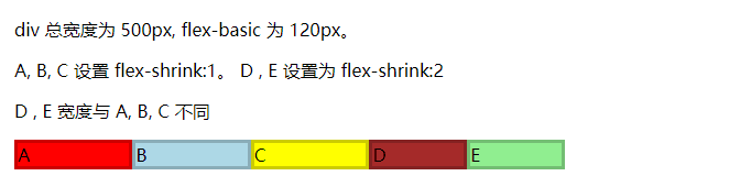
3.flex-shrink
flex-shrink 属性指定了 flex 元素的收缩规则。flex 元素仅在默认宽度之和大于容器的时候才会发生收缩,其收缩的大小是依据 flex-shrink 的值。
.item {
  flex-shrink: <number>; /* default 1, 负数无效 */
}
<!DOCTYPE html>
<html>
<head>
<meta charset="utf-8">
<title>aaa</title>
<style>
#content {
  display: flex;
  width: 500px;
}

#content div {
  flex-basis: 120px;
  border: 3px solid rgba(0,0,0,.2);
}

.box {
  flex-shrink: 1;
}

.box1 {
  flex-shrink: 2;
}
</style>
</head>
<body>

<p>div 总宽度为 500px, flex-basic 为 120px。</p>
<p>A, B, C 设置 flex-shrink:1。 D , E 设置为 flex-shrink:2</p>
<p>D , E 宽度与 A, B, C 不同</p>
<div id="content">
  <div class="box" style="background-color:red;">A</div>
  <div class="box" style="background-color:lightblue;">B</div>
  <div class="box" style="background-color:yellow;">C</div>
  <div class="box1" style="background-color:brown;">D</div>
  <div class="box1" style="background-color:lightgreen;">E</div>
</div>

</body>
</html>
4.align-self
对齐弹性对象元素内的某个项。
.item {
  align-self: auto | flex-start | flex-end | center | baseline | stretch;
}
5.flex(flex-grow, flex-shrink 和 flex-basis 的简写)
.item {
  flex: none | [ <'flex-grow'> <'flex-shrink'>? || <'flex-basis'> ] /*默认0 1 auto*/
}
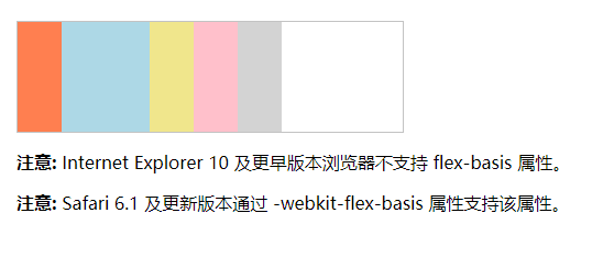
6.flex-basis
flex-basis 属性用于设置或检索弹性盒伸缩基准值。
.item {
  flex-basis: <length> | auto; /* default auto */
}
<!DOCTYPE html>
<html>
<head>
<meta charset="utf-8">
<title>aaa</title>
<style>
#main {
    width: 350px;
    height: 100px;
    border: 1px solid #c3c3c3;
    display: -webkit-flex; /* Safari */
    display: flex;
}

#main div {
    -webkit-flex-grow: 0; /* Safari 6.1+ */
    -webkit-flex-shrink: 0; /* Safari 6.1+ */
    -webkit-flex-basis: 40px; /* Safari 6.1+ */
    flex-grow: 0;
    flex-shrink: 0;
    flex-basis: 40px;
}

#main div:nth-of-type(2) {
    -webkit-flex-basis: 80px; /* Safari 6.1+ */
    flex-basis: 80px;
}
</style>
</head>
<body>

<div id="main">
  <div style="background-color:coral;"></div>
  <div style="background-color:lightblue;"></div>
  <div style="background-color:khaki;"></div>
  <div style="background-color:pink;"></div>
  <div style="background-color:lightgrey;"></div>
</div>

<p><b>注意:</b> Internet Explorer 10 及更早版本浏览器不支持 flex-basis 属性。</p>
<p><b>注意:</b> Safari 6.1 及更新版本通过 -webkit-flex-basis 属性支持该属性。</p>

</body>
</html>